Large Group Family Photo Color Schemes and Outfit Ideas


Large group family photo color schemes can feel overwhelming when you’re coordinating grandparents, siblings, cousins, spouses, toddlers, and maybe even the family dog. If you’re planning an extended family photoshoot in San Mateo County or the San Francisco Peninsula, the good news is that coordinating outfits is much simpler than most families think.
The best large group family photo color schemes create a cohesive, timeless look without making everyone wear the exact same thing. In fact, one of my biggest tips for organizing a large family photoshoot is to keep everything as simple as possible.
The more people involved, the simpler the plan should become.
If you’re planning an extended family session, my Bay Area family photography experience is designed to make the process feel simple, relaxed, and enjoyable from start to finish.
What Are Large Group Family Photo Color Schemes?
Large group family photo color schemes are coordinated color palettes that help multiple family members look cohesive in photos without requiring everyone to wear identical outfits.
Instead of putting twenty people in matching white shirts and jeans, a color scheme uses two to three complementary colors that work together naturally.
This creates photos that feel timeless, connected, and visually balanced.
For most extended family sessions, I recommend choosing two to three colors and having everyone stay within that palette.
That’s it.
No complicated rules, color charts, or Pinterest boards with five shades of beige.
Simple almost always photographs best.
Large Group Family Photo Color Schemes: The Formula We Used for Our Own Family Photos
One of my favorite examples of large group family photo color schemes actually comes from my own family.
Every year we take family photos together, and recently we decided to schedule our annual session early in the summer instead of waiting until fall. June is both my birthday month and my son’s birthday month, so it felt like the perfect time to update our family photos before the busy season begins.
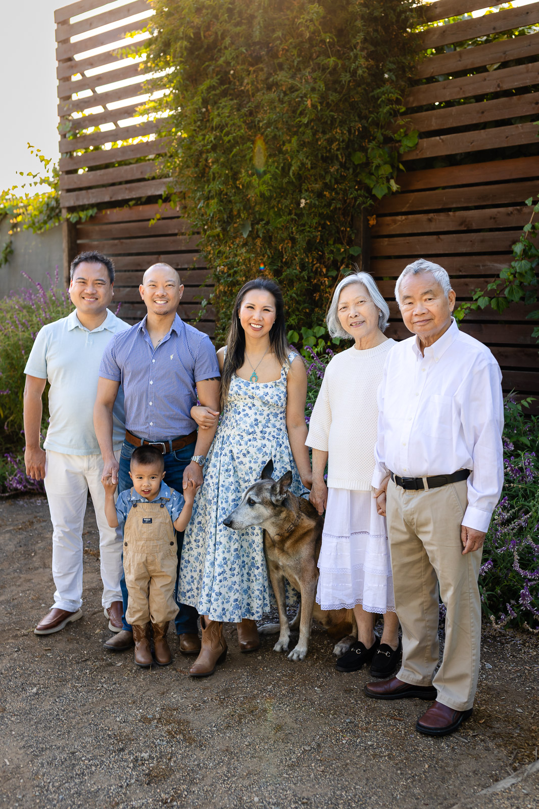
This year we included grandparents as well.
My in-laws are getting older.
Our dog is getting older.
And if there is one thing family photography has taught me, it’s that there is never a perfect time to wait for photos.
When it came time to coordinate outfits, we kept things incredibly simple.
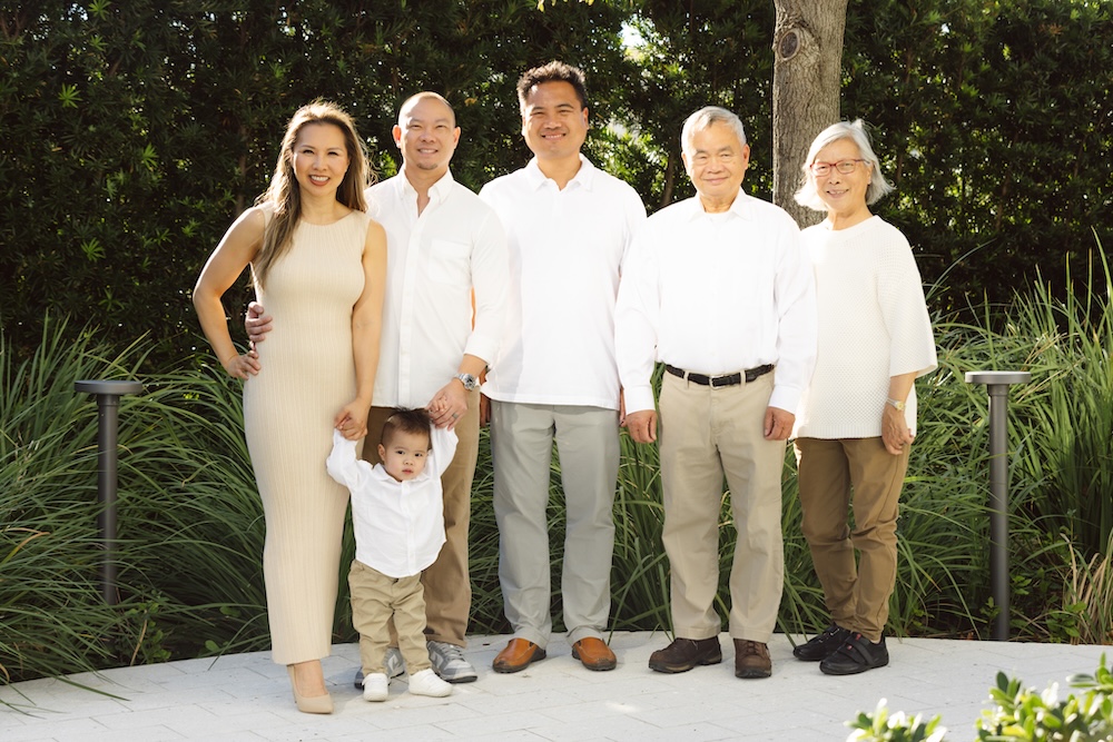
2024 Color Scheme
- White
- Khaki
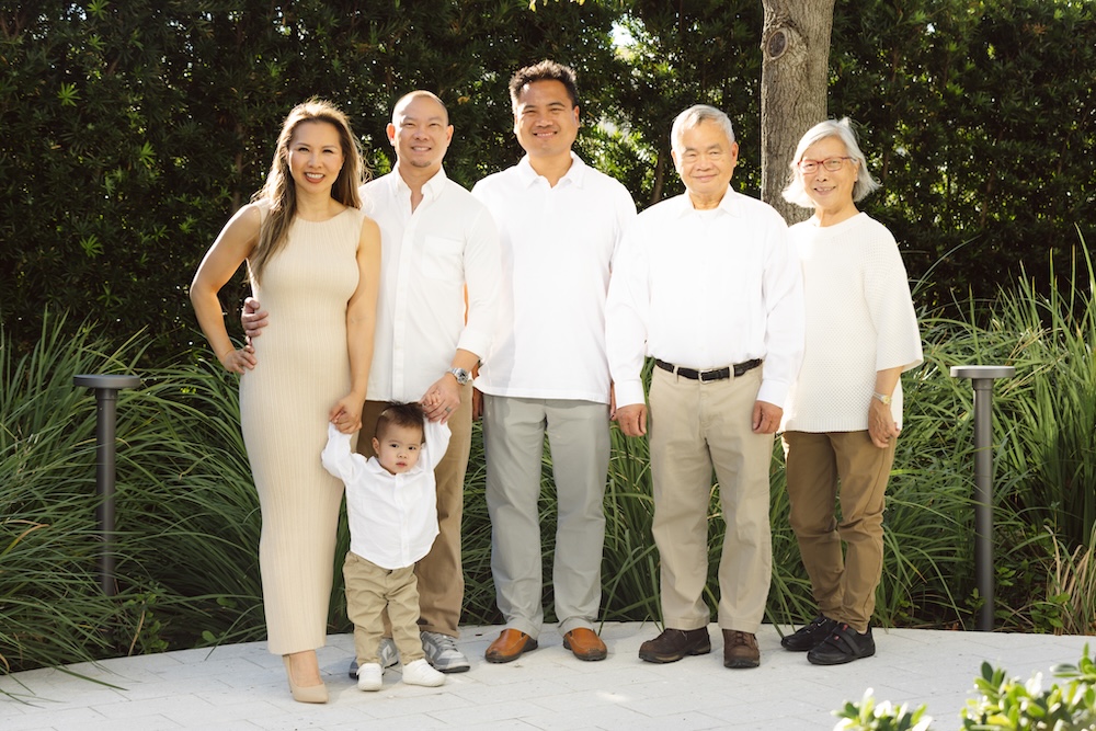
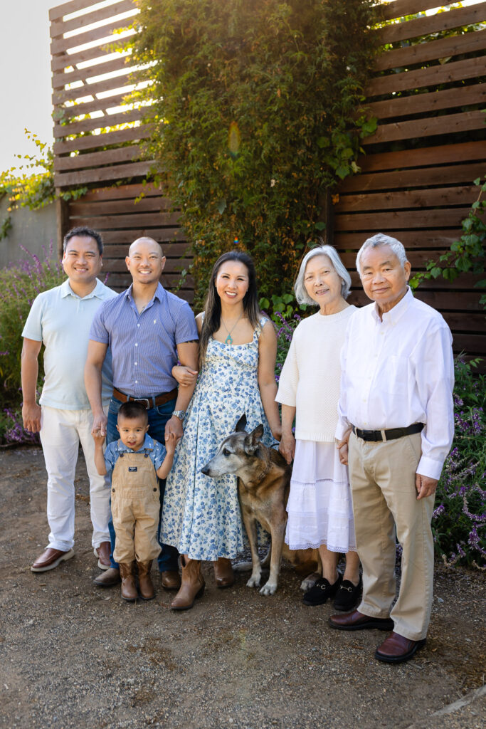
2025 Color Scheme
- White
- Khaki
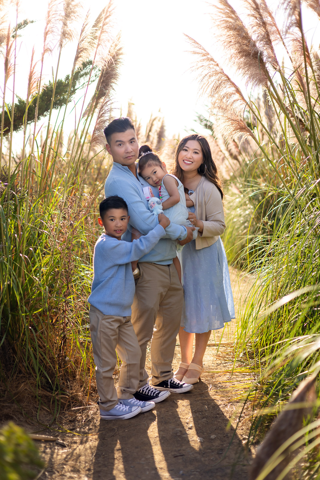
- Light Blue
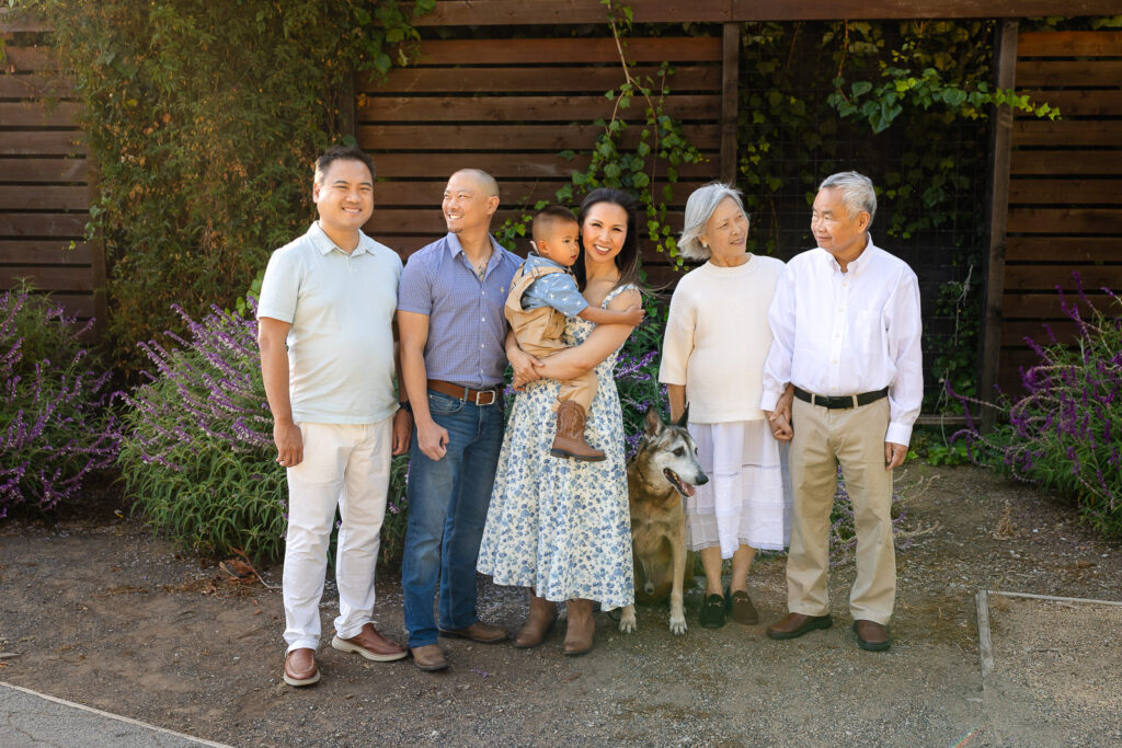
That was the entire plan.
Everyone could wear one color, two colors, or all three colors.
The only rule was that nothing outside the palette was allowed.
No need to match outfits, just coordinate colors.
Keeping the color palette simple made shopping easier for everyone and helped the photos feel coordinated without looking overly matched.
Remove Friction
One of the biggest mistakes families make when planning extended family photos is creating too many rules.
The goal isn’t finding the perfect outfit.
The goal is making the plan easy enough that everyone actually follows it.
When I’m helping coordinate a large group, I try to remove as much friction as possible.
That means choosing colors people probably already own.
A white shirt.
A blue button-down.
A denim jacket.
Khaki pants.
A cream sweater.
Most people already have those pieces hanging in their closet.
When you choose simple colors that people already own, you dramatically increase the chances that everyone shows up coordinated.
This is especially true when grandparents are involved.
I wanted our family photos to feel easy for everyone. My in-laws shouldn’t have to spend weeks shopping or worrying about what to wear. By choosing simple, timeless colors they already owned, getting ready for the session was almost effortless.
Sometimes the secret to coordinating twenty people isn’t finding the perfect outfits.
It’s making the process so easy that everyone actually follows through.
My Favorite Large Group Family Photo Color Schemes
One of the easiest approaches to large family photo outfit ideas is assigning a color palette instead of specific outfits.
| Color Palette | Best For | Why It Works |
|---|---|---|
| Forest Green + Cream | Redwood forests, parks, holiday sessions | Fresh, elegant, and one of the most timeless outdoor color combinations. |
| Forest Green + Camel | Fall family photos, wooded locations | Rich, earthy, and sophisticated with beautiful natural contrast. |
| Cream + Camel | Beaches, open fields, year-round sessions | Soft, warm, and timeless. One of my favorite palettes for families. |
| Beige + Chocolate Brown | Golden fields, rustic settings | Adds warmth and depth while still feeling classic. |
| Light Blue + Chocolate Brown | Coastal locations, casual family sessions | Soft blue balances the richness of brown for a polished look. |
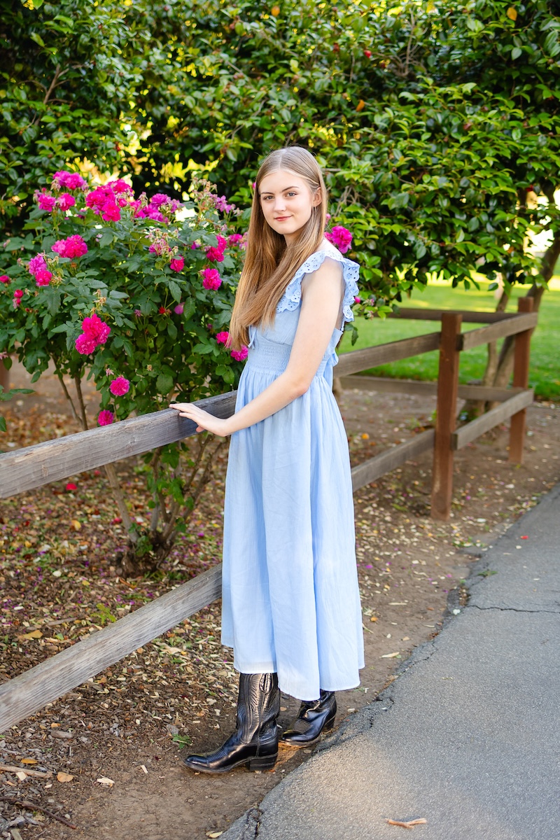
| Light Blue + White | Spring and summer family photos | Crisp, airy, and classic with a bright, fresh feel. |
| Cream + Burgundy | Fall and holiday family photos | Warm, luxurious, and perfect for autumn and winter portraits. |
| Cream + Tan | Year-round outdoor sessions | Calm, minimal, and beautifully timeless. |
| Sage Green + Cream | Gardens, parks, spring sessions | Soft, natural, and complements outdoor landscapes beautifully. |
| Grey + Blush Pink | Spring, maternity, families with young children | Feminine, sophisticated, and soft without feeling overly sweet. |
| Navy + Camel | Beaches, parks, year-round sessions | A timeless combination that photographs beautifully on every skin tone. |
| Rust + Cream | Autumn and golden hour sessions | Warm, inviting, and perfect for fall landscapes. |
Then let each family member choose clothing that fits their own style.
This approach works especially well because grandparents, teenagers, toddlers, and adults all have different preferences and comfort levels.
The goal is coordinated, not identical.
If you’re still deciding what everyone should wear, my guide on what to wear for a family photoshoot includes additional outfit examples, color palettes, and styling tips.
Coordinating outfits is only one piece of the puzzle. These family photoshoot tips can help everyone feel prepared and relaxed before the session.
What Colors Are Good for Family Pictures?
Neutrals and soft pastels tend to photograph beautifully in almost every setting and season.
Some of my favorite color combinations include:
- White, khaki, and light blue
- Cream, beige, and olive green
- Cream, rust red, and camel
These colors work beautifully at the beach, in redwood forests, open fields, parks, and backyard family gatherings.
They’re timeless, flattering on most skin tones, and easy for family members to coordinate.
If you’re unsure where to start, white, khaki, and light blue is one of the easiest and most universally flattering combinations for extended family photos.
Best Colors for Family Pictures Outside
Outdoor family photos generally look best when your colors complement the environment.
Best Colors for Family Pictures Outside
| Location | Recommended Color Palettes | Why It Works |
|---|---|---|
| Coastal Locations Pacifica, Half Moon Bay | • White + Cream • Cream + Camel • Light Blue + White • Navy + Camel | Complements the soft blues of the ocean and sky while keeping the focus on your family. |
| Redwood Locations Redwood Grove Nature Preserve, Huddart Park | • Forest Green + Cream • Forest Green + Camel • Sage Green + Cream | Earthy tones blend naturally with the rich greens and warm browns of the forest. |
| Open Fields & Golden Grass Pampas Grass Fields, Coyote Point | Beige + Chocolate Brown • Rust + Cream • Cream + Camel | Warm neutrals pair beautifully with golden grass and sunset light. |
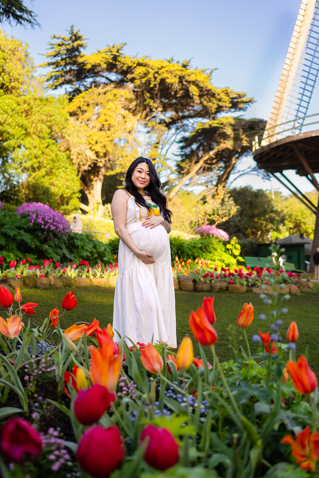
| Parks & Gardens Fioli, Washington Park | • Grey + Blush Pink • Sage Green + Cream • Light Blue + White | Soft colors complement blooming flowers and lush greenery without overpowering the landscape. |
When choosing a color palette, think about the environment as much as the outfits. The most beautiful family photos happen when your clothing complements the landscape rather than competing with it. That’s one reason I often recommend neutrals, pastels, and warm earth tones for outdoor family photos throughout San Mateo County and the San Francisco Peninsula.
Choosing the right location can be just as important as choosing the right colors. Here are some of my favorite family photo locations on the San Francisco Peninsula that photograph beautifully year-round.
Large Group Family Photo Color Schemes by Season
| Season | Recommended Color Palettes | Why It Works |
|---|---|---|
| Spring | • Sage Green + Cream • Grey + Blush Pink • Light Blue + White • Cream + Tan | Soft colors complement blooming flowers, fresh greenery, and the lighter feel of spring. |
| Summer | • Cream + Camel • Light Blue + White • Navy + Camel • White + Khaki + Light Blue | Light colors feel airy and timeless while keeping family photos bright and relaxed. |
| Fall | • Forest Green + Cream • Forest Green + Camel • Cream + Burgundy • Rust + Cream • Beige + Chocolate Brown | Warm earth tones pair beautifully with golden light and autumn landscapes. |
| Winter | • Cream + Burgundy • Forest Green + Cream • Navy + Camel • Cream + Tan | Rich neutrals and deeper tones create a classic, timeless look during winter. |
If you’re unsure which palette to choose, don’t overthink it. Neutrals and soft pastels photograph beautifully year-round and work in almost every location, whether you’re planning photos at the beach, among the redwoods, in an open field, or at your favorite local park. The best large group family photo color schemes are often the simplest ones. Choose two to three complementary colors, let everyone wear one, two, or all of the colors, and focus on enjoying time together rather than creating the perfect outfit.
What If We Want Matching Christmas Pajamas?
Matching holiday pajamas, Disney outfits, or coordinated family shirts can be absolutely adorable in photos.
The tradeoff is that they require more planning.
If your goal is for everyone to wear the exact same pajamas or specific print, I recommend having one designated organizer.
Think of them as the family project manager.
They can collect sizes, coordinate orders, and make sure everyone receives the correct items.
If you’re planning matching Christmas pajamas, I recommend ordering as early as September.
Popular prints and sizes often sell out long before the holidays arrive, especially for toddlers and grandparents.
The more specific the outfit requirements, the earlier you should plan.
The more flexible the color palette, the easier it becomes for everyone involved.
Frequently Asked Questions
What is the best color scheme for a large family photo?
Neutrals and soft pastels tend to photograph beautifully in almost every setting and season.
White, khaki, light blue, cream, beige, sage green, denim, and soft rust tones are all excellent choices.
Should everyone wear the exact same color?
No.
Choose two or three complementary colors and let everyone wear one, two, or all three colors.
The goal is coordination, not matching.
What colors should we avoid outdoors?
Avoid neon colors, large logos, graphic tees, and large brimmed hats that cast shadows across the face.
How many colors should a large family group include?
Two to three complementary colors is usually perfect.
The simpler the plan, the easier it is for everyone to follow.
How far in advance should we plan?
As soon as possible.
Once the photoshoot is booked, send a group text with the date, color palette, and two or three inspiration photos.
Visual examples make it easy for everyone to understand what you’re aiming for.
Final Thoughts on Large Group Family Photo Color Schemes
The best large group family photo color schemes are the ones that help your family feel comfortable, connected, and like themselves.
Years from now, nobody will remember whether the shade of blue was perfect.
You’ll remember the grandparents who were there.
The cousins who were little.
The family dog who wandered into the frame.
The season of life you never want to forget.
Beautiful family photos are never about perfection.
They’re about the people you love.
The best family photos happen when everyone feels relaxed, comfortable, and free to simply enjoy being together. That’s why I focus on creating stress-free family photos that feel natural and enjoyable for parents, grandparents, and children alike.
Planning Extended Family Photos?
Whether you’re coordinating grandparents, cousins, siblings, or multiple family households, I’d love to help make the experience feel simple and enjoyable. From choosing locations and coordinating outfits to guiding everyone during the session, I’ll help you every step of the way.

READ LATEST
the


Hi, I'm Ellen.
I come from a project management and engineering background, so I naturally love planning, organization, and making things feel easy.
As a toddler mom myself, I know how busy life can feel and how quickly these seasons pass.
My goal is to create beautiful photos through an experience that feels relaxed, thoughtfully guided, and genuinely enjoyable.

follow along @ellobelle.photography
+ Show / Hide Comments
Share to: